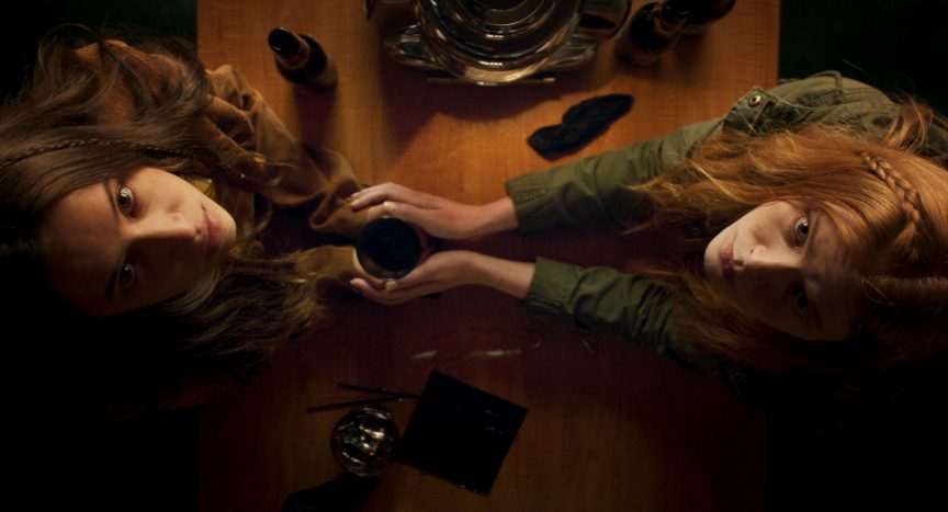
After making a splash at SXSW, Elle Callahan’s horror/thriller Witch Hunt is now available on demand and digital. In case you aren’t familiar with Witch Hunt, the description says, “In a modern America where magic is real and witches are persecuted by US authorities, teenager Claire and her family are part of an intricate network that helps these women escape across the border to seek asylum in Mexico. However, when their mode of transport is disrupted by federal witch hunters, trouble befalls the family as they struggle to hide two young witches within the walls of their home. As witch hunters close in and strange magic begins haunting the family, Claire discovers that she may have more in common with these witches than she could have ever imagined.” Witch Hunt stars Gideon Adlon (The Craft: Legacy, Blockers), Abigail Cowen (Fate: The Winx Saga, Chilling Adventures of Sabrina), Christian Camargo (The Hurt Locker), and Elizabeth Mitchell (Lost, The Expanse). After watching Witch Hunt, one can tell that a lot of thought went into the production design. The color choices and the look of Claire’s home specifically. The woman responsible for this look, production designer Holly Trotta. In the below Q&A, Holly goes in depth about her work on the film.

Wicked Horror: What did you do to prepare for your work on Witch Hunt?
Holly Trotta: Key for me is to start ANY project with tons of research. Elle Callahan, Director, and I had many discussions early on, even before pre-production, about the look and feel for this film. She wanted the film to take place in modern day, but have a stylized twist. I can work in any genre, but my favorites are the more stylized edgier pieces. I love to play with color! For this film we were primarily focused on bringing in earth tones and a neutral color palette. So that’s where my research started. I spent a great deal of time watching movies, looking at old photographs and studying the geography and culture of specific locations. I really love to “live” in the world’s I create, so it’s important for me to dive deep into research mode in order to drive my crew in the right direction when they come on board.
Wicked Horror: Witch Hunt director, Elle Callahan, wanted the entire look and feel of the film to be as if you were shooting on location in Salem, Massachusetts. What is it about Salem that she wanted to replicate?
Holly Trotta: Salem has a long history of witchcraft in their culture. If you’ve ever been, the town has a unique vibe and energy. New England’s style of architecture feels vastly different than Los Angeles, and there is a specific look to the type of buildings in Massachusetts. Since we couldn’t physically travel there it was important to find a similar feel here in Los Angeles, which is more challenging than one would think. We really didn’t want to see any palm trees in this film. It would throw us out of context. We wanted to bring the same feeling and energy you feel in Salem into this film. Any emotion can only be achieved when you fully believe you are in a particular place, and that’s exactly what we were trying to achieve.

Holly Trotta
Wicked Horror: You worked with cinematographer Nico Aguilar on the film Phobias, as well as Witch Hunt. Was this just a coincidence? How often do your paths cross during production?
Holly Trotta: That was definitely not a coincidence. When I heard Nico was being considered for the project, I told Elle he was a must to work with. I really enjoy working with Nico, and think he’s extremely talented. We’ve worked on many other projects together besides these two films and both our work heavily complement each other. There’s a dynamic to the way he works with light. It adds a whole other level of dimension on camera. You can only go so far in creating a look and feel with color and the style of furniture you source.
I think it’s extremely important for any production designer and Director of Photography to be in sync throughout pre-production and into filming in order for a film to be successful from a visual standpoint. We were constantly talking about light and how to implement it more naturally into the sets. He’s big on particles, so I was always sending him fixtures and discussing how these would cross over into his department. We hashed out every little detail in pre and pro so when we got to set there were no surprises.
Wicked Horror: You built a maze for the scenes when the witches are behind the walls. Can you talk a little more about this? Where were the maze scenes shot?
Holly Trotta: Since the current location at Big Sky Movie Ranch didn’t have anything that we could use for these scenes, we did what every production designer loves to do, build it. The witches lived and hid behind the walls of Claire’s house. The house itself was quite large. We had to visually give the audience that same feeling in order for it to be believable. My department’s budget wasn’t extensive on this film, so we had to get creative about the way we wanted to build the maze to look and feel much grander than what we could afford. I worked with my Art Director, Eric Quintana, on physically building the maze to give it that exact affect.
We constructed the interior section of the maze in a small barn located across from Claire’s house and used the existing outer portion of the barn’s architecture to match the interior we created. When this was being filmed, the actors and camera could go in endless loops without knowing where the beginning and end was to give the illusion one was traveling through different parts of the house.
Wicked Horror: Stylistically, do you have a favorite scene in the film?
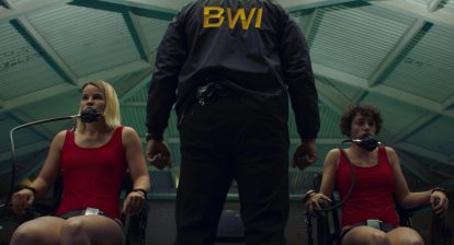
Holly Trotta: Yes, there are two scenes that come to mind. Claire’s living room and some of the scenes where the girls were strapped to chairs and dunked into the pool.
I loved the look we were able to create in the living room. The house location was completely empty when we arrived. This gave us the ability to create from scratch, which is the ideal in any scenario. The pool scenes were graphic and had an energy to them on camera. That, coupled with the camera angles, really created something dynamic to look at. I enjoyed working with the stunt team in this section as well. They do some amazing work that makes the film really come to life.
Wicked Horror: The blue butterfly figurine holds a lot of significance in the film. How did you decide on this object? If it wasn’t going to be a butterfly, what would it have been?
Holly Trotta: Elle was insistent about a blue butterfly. It had to be an inanimate object, for part of the magic was bringing that figure to life. I think there is a beauty in the transitions a butterfly makes in its various stages of life. It grows and morphs from one body to another, making a complete transformation. This directly correlated with Claire’s discovery of the powers she held. So, the butterfly and Clare’s powers complemented each other. It was fairly easy to find the object. The butterfly was actually made of glass. That was the first thing I thought about when it was being sourced. Blown glass objects are eye catching when done right and are more durable than taxidermy. We did have to make some alternations for the post team to be able to properly animate the butterfly.
Wicked Horror: Aside from all the witches having orange hair in the film, it seems like the color orange reoccurs all throughout the film on different objects. How much of this was on purpose?
Holly Trotta: That choice of color was intentional. Elle and I wanted to make ensure the tone was consistent throughout the film by predominately using an earthly color palette. I wanted everything to feel warm, and quiet by bringing in various shades of brown, green, and yellow. Orange, being within the yellow color spectrum, was something that was inevitable. The film did take place in modern day. However, the look was made more stylized by bringing in older furniture that was used and slightly dated, as if they were heirlooms passed down from generation to generation. This helped compliment the environment it was encompassed in. By using this color scheme, the moments we incorporated blue, really had a punch and stood out more. The significance of blue was important, and all those colors as a whole, complimented each other in a nice way.

Wicked Horror: Witch Hunt received a lot of attention around its premiere at SXSW. What was one of your favorite things you read online after the premiere?
Holly Trotta: Kat Hughes from TheHollywoodNews.com had a lot of nice things to say in her review of the film. I think she really understood what Elle was going for. One of the things she said is that “Witch Hunt is completely reinventing the underappreciated witch genre.”
Wicked Horror: What was the biggest challenge you faced with the production design while filming Witch Hunt? How did you overcome it?
Holly Trotta: The two biggest challenges while working on this film were time and money. I think every Art Department faces similar issues in budget throughout any production. However, you need to have enough money AND time in order to bring a vision to life. There are so many ideas! It is best to clearly identify the vision you have in mind. Believe it or not, my department had only two weeks prep before we hit set. My Art Director, Eric Quintana, who was also set decorating, was always out shopping for the next sets to come. I have an obsession for the details. It’s what really bring a space to life. I wasn’t able to bring in as much detail as I wanted into the film due to the budget.
One must always be flexible and patient in order to be successful in this field. When we needed to pivot, we did. My team did a lot of thrift shopping and we got creative in how some of the sets were designed in order to make the budget fit. I also had many discussions with Elle on things we could change without having to sacrifice too much of her vision.


